Scaling blockchain operations for businesses through secure custodial layers and multi-party computation (MPC) wallets.
The Context: Bridging the Infrastructure Gap
It is no longer a question of if businesses will enter the Web3 space, but how. Bitpowr serves as the critical bridge, providing the building blocks, from multi-chain wallet SDKs to automated settlement layers, that allow companies to scale digital asset operations without the massive overhead of building a custom blockchain team.
As the product designer on the engagement, I was responsible for the end-to-end design evolution of the Bitpowr ecosystem. My mission was to move the platform beyond its “technical-first” roots and transform it into a world-class institutional product. Working in a tight-knit squad of product managers, engineers, and market analysts, I acted as the bridge between technical capability and user-centric clarity.
The Core Constraint
Building for B2B blockchain infrastructure meant designing for “Maximum Stakes.” Any UI friction wasn’t just annoying, it was a potential security risk.
The Trust Gap: Institutional clients require absolute clarity on fund security and approval states; any ambiguity leads to churn.
Complexity at Scale: Managing multiple wallets, assets, and team permissions across different exchanges creates massive cognitive load.
The “Wait-Time” Friction: Blockchain transactions aren’t instant. The UI had to bridge the gap between “Initiated” and “Confirmed” to prevent user anxiety.
Design Evolution: From Technical Debt to Institutional Clarity
Moving beyond a “developer tool” to build a trusted business command center. I focused on removing the “technical noise” so businesses could manage global assets with the same ease as a traditional bank account.
A Simpler Start (The Sign-Up Flow)
The Problem (Old): The original sign-up felt like a technical manual. It asked for too much data upfront, making users feel like they were “working for the app” before they even saw the value.
Strategic Shift: I broke the onboarding into three simple, logic-based buckets: Who are you? What is your business? How do you want to start? My Thinking: By grouping these steps, I reduced the “form fatigue.” It makes the first 30 seconds of the app feel supportive rather than overwhelming.
Before
After
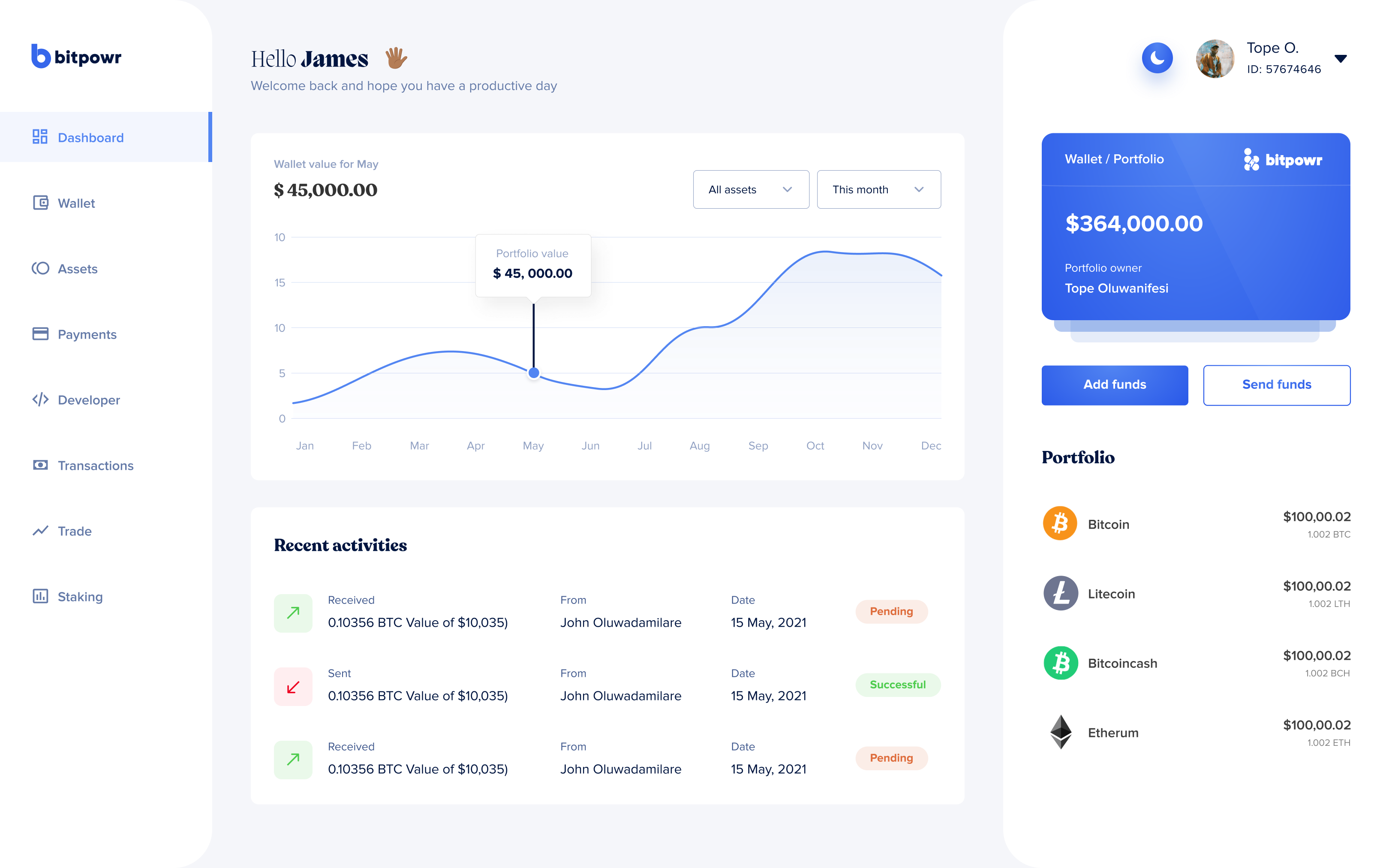
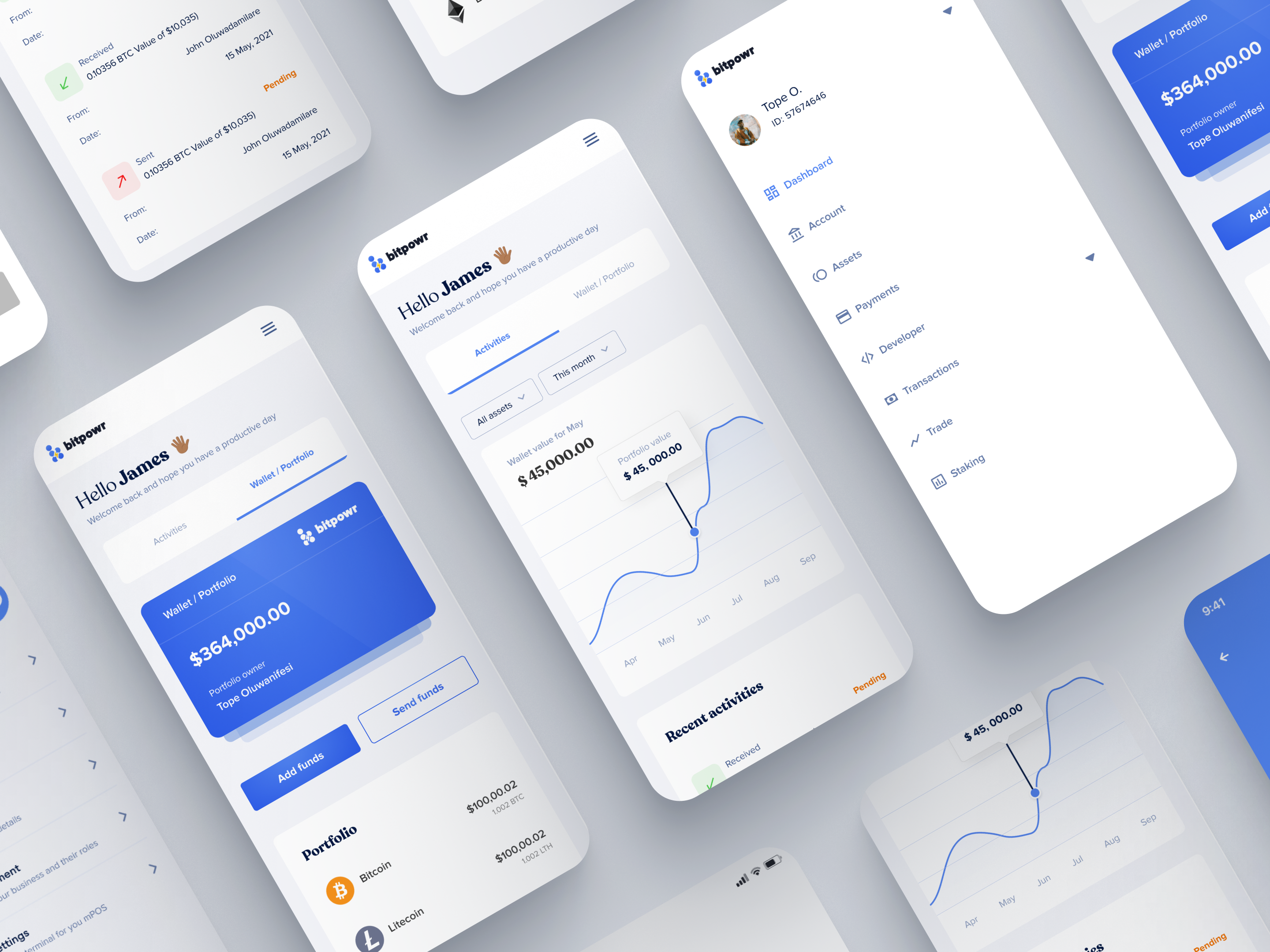
A Clearer View (The Dashboard)
The Problem (Old): The old dashboard was just a list of numbers. It was hard to tell how much money was where, especially when assets were split across different blockchains.
Strategic Shift: I redesigned the home screen to lead with a Total Liquidity Summary and added a simple “Quick Actions” bar for the things people do most: Send and Receive.
My Thinking: I wanted users to find their balance in under 5 seconds. By cleaning up the layout, I made the complex data feel manageable and “safe.”
Before
After
The Transaction Ledger
The Problem (Old): The old list didn't show the “status” of a team. In a business, multiple people often need to approve a transfer, but the old UI didn't show who was holding things up.
Strategic Shift: I added a simple Status Tracker to every transaction. Now, you can see exactly who has signed and who is still pending at a glance.
My Thinking: Trust is built on transparency. Showing the “Approval Chain” helps teams work faster and removes the guesswork from corporate governance.
Before
After
Managing Everything in One Place (The Asset Page)
The Problem (Old): The legacy card-based layout was visually taxing and functionally limited, providing zero detail on specific holdings and forcing users to click through multiple layers just to see simple balances. This design hit a “Scalability Wall”: card layouts work for a handful of tokens, but they collapse under an enterprise treasury managing dozens.
Strategic Shift: I moved away from restrictive cards to a Scalable Tabular System that prioritizes data density and scannability. This new architecture includes a universal toggle that allows users to instantly filter between Crypto, Local Currency (Fiat), and Exchange balances, while integrating direct action shortcuts like Send and Receive into every row.
My Thinking: A business is not just a “crypto wallet”—it is a complex portfolio that requires a high-level “Single Source of Truth.” By shifting to a list-based view, I ensured the interface could scale to manage 100+ assets without losing integrity
Before
After
Beyond the Redesign
While the redesign fixed the core experience, we also needed to build new features to help businesses actually use and grow their money. We weren't just polishing the old design anymore as we were adding the essential pillars that institutional clients needed to run their daily operations.
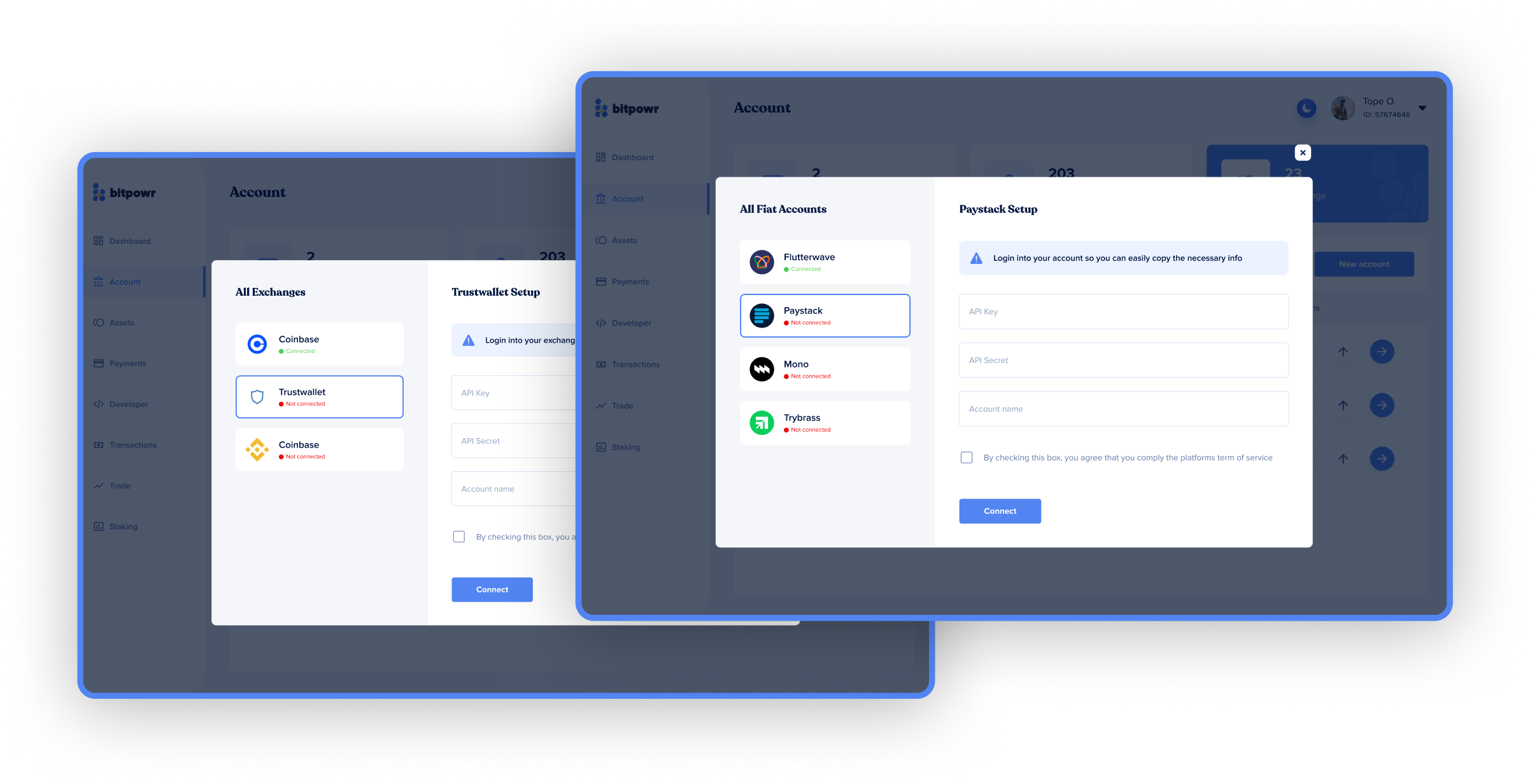
Exchange and FIAT Connection
The Problem: Before this feature, users had to manually exit Bitpowr to check balances or move funds between Centralized Exchanges (CEX) and their bank accounts, creating a fragmented and risky operational flow.
The Strategic Shift: I integrated exchange APIs directly into the core navigation, allowing users to connect their external accounts (like Binance or Coinbase) and view them as native sub-accounts within Bitpowr.
My Thinking: Centralizing the view of CEX, On-chain, and Fiat balances transforms the app from a simple wallet into a Global Liquidity Manager. This setup gives users the confidence to move assets across different rails in seconds without the fear of manual copy-paste errors.
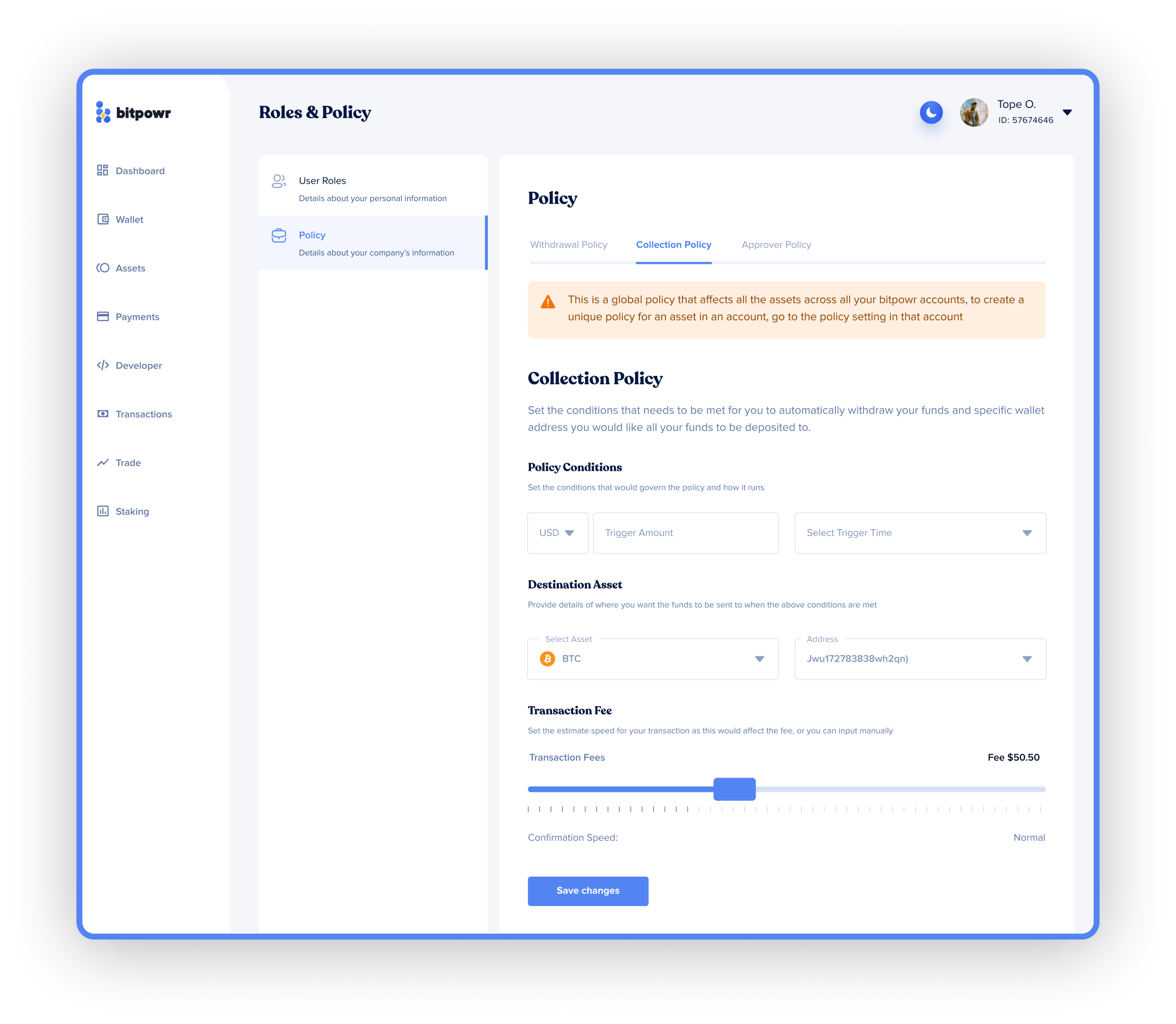
Advanced Governance (Account Policy)
The Problem: In a business environment, having a “one-size-fits-all” security model is dangerous. Large organizations needed a way to enforce strict spending limits and complex approval rules to prevent internal fraud or accidental loss.
The Strategic Shift: I designed a granular Rules & Policy Engine where admins can define specific conditions, such as transaction ceilings, required approvers, and destination whitelisting, at both the global and account levels.
My Thinking: Security should be invisible but invincible. By making these high-level policies easy to configure via a simple interface, I gave businesses the “guardrails” they need to scale their team's access without sacrificing control over their capital.
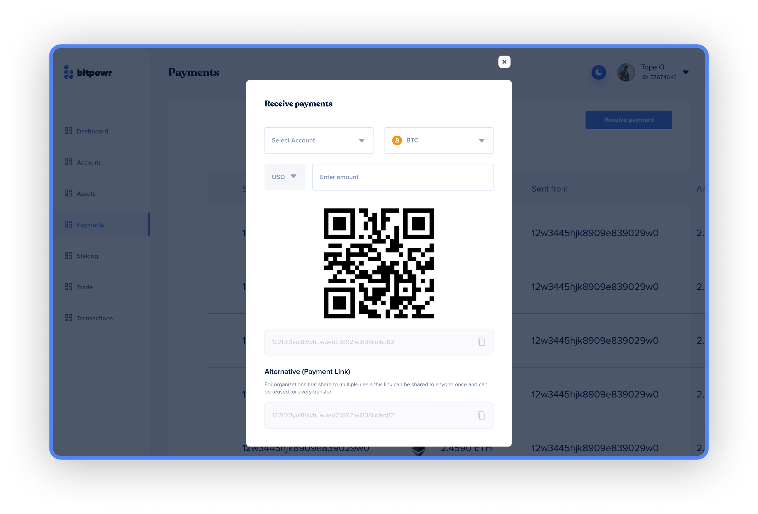
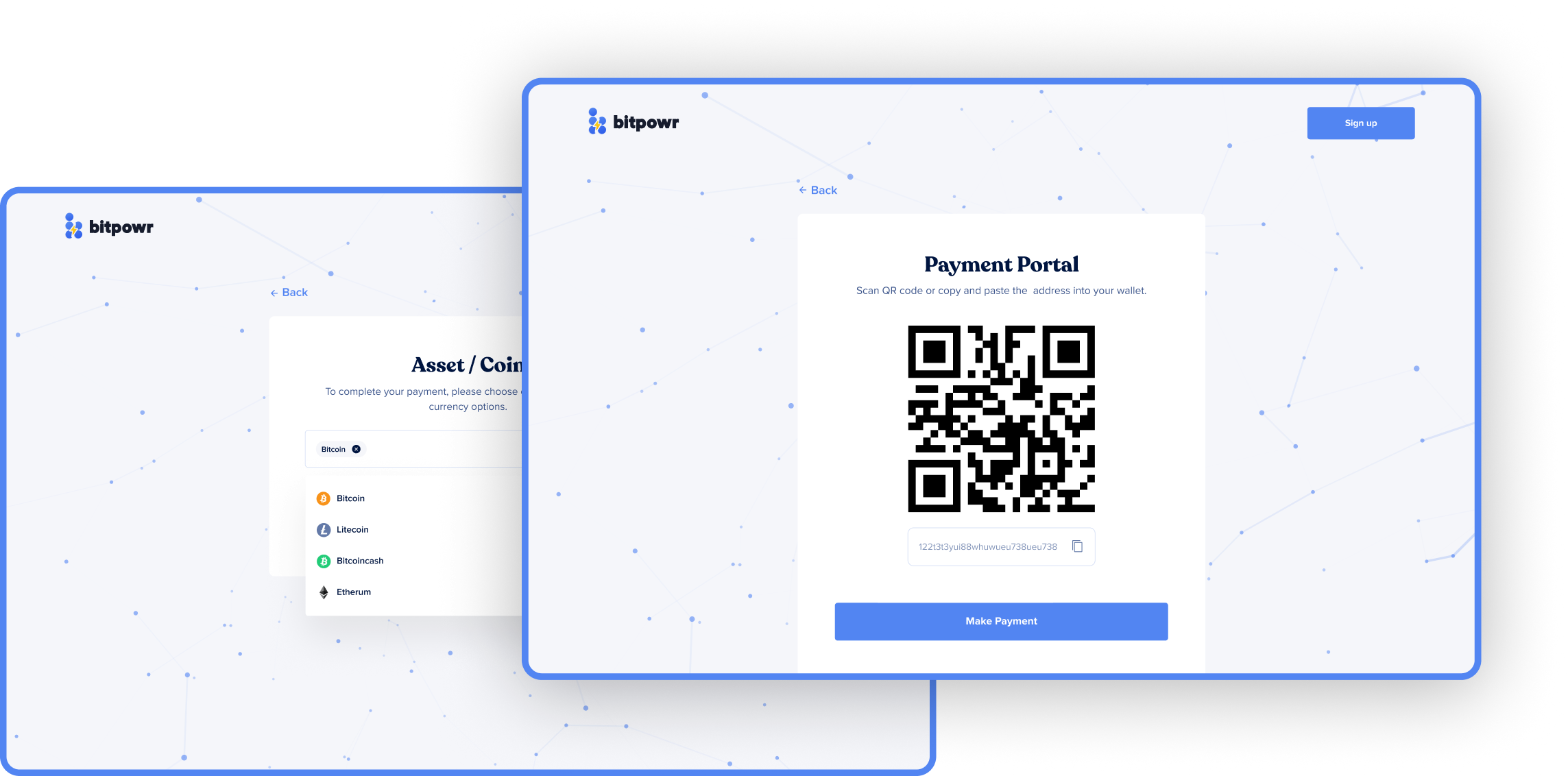
Streamlined Receive Payments
The Problem: Generating wallet addresses for clients was a manual, technical task that often confused non-technical payers and led to reconciliation headaches for the business.
The Strategic Shift: I introduced a dedicated Payment Request Interface that generates dynamic QR codes and reusable payment links with preset amounts and asset types.
My Thinking: I wanted to make “Receiving” as professional as an invoice. By automating the address generation and providing a clear “Alternative Link” for those without crypto wallets, we removed the friction of B2B crypto settlements.
Robust E-commerce Checkout
The Problem: E-commerce merchants lacked a secure, “plug-and-play” way to accept crypto payments on their own websites without building a custom blockchain integration from scratch.
The Strategic Shift: I developed a standardized Payment Portal (Checkout) that merchants can embed into their platforms, providing a clean, trusted interface for their customers to pay in any supported token.
My Thinking: Success for Bitpowr is tied to the success of the businesses building on it. By providing a “checkout-as-a-service” feature, we lowered the barrier to entry for merchants, effectively turning Bitpowr into a revenue engine for our clients.
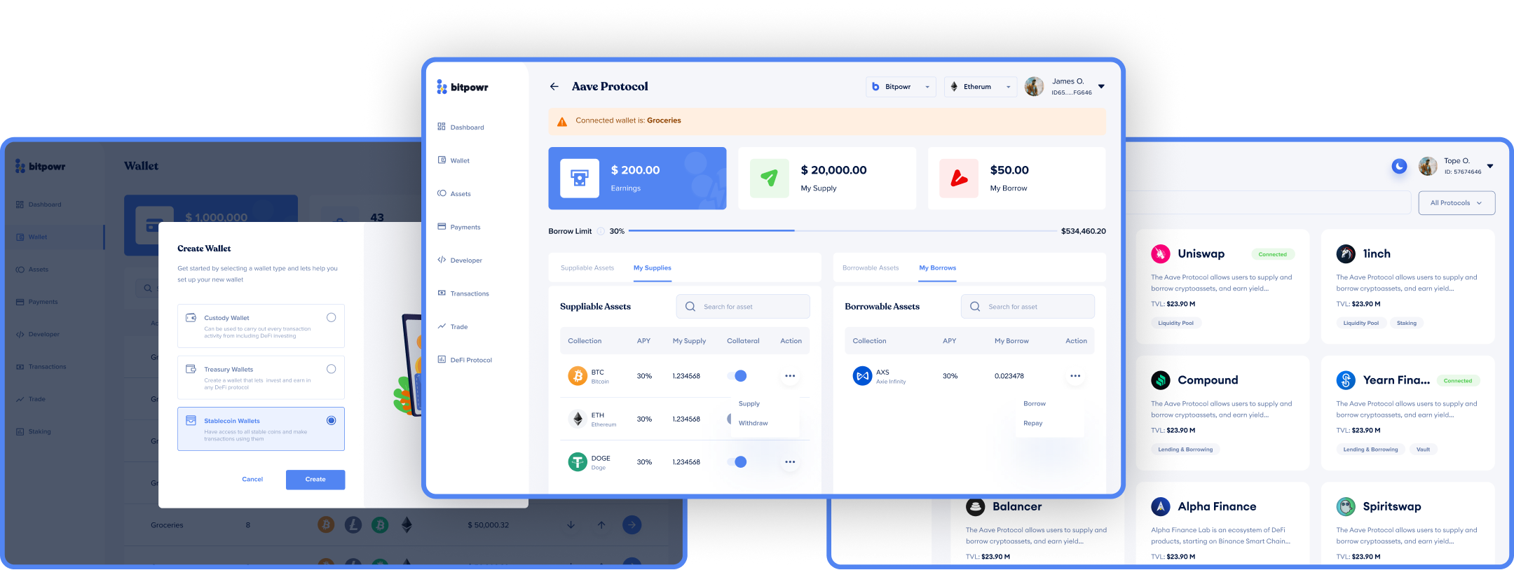
DeFi Investment Portfolio
The Problem: Most custodial wallets are “dead ends” where assets sit idle. Businesses had no way to put their capital to work (like earning yield or staking) without transferring funds out to risky, external protocols.
The Strategic Shift: I designed a native DeFi Investment Wallet that allows users to browse and select various protocols to stake their assets directly from the Bitpowr dashboard.
My Thinking: I wanted to evolve the wallet from a storage container to a wealth-building tool. Integrating DeFi allows businesses to manage their idle treasury and earn passive income within the same secure environment they use for daily operations.
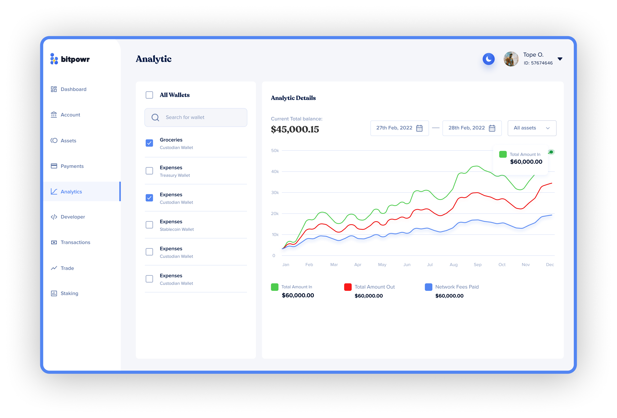
Account Analysis
The Problem: Raw transaction logs are terrible for spotting trends. Financial officers were struggling to visualize their asset growth, expense ratios, or network fee overhead over time.
The Strategic Shift: I created an Analytics Module featuring interactive growth charts, asset distribution breakdowns, and detailed expense tracking by wallet or network.
My Thinking: Data is only useful if it’s actionable. By turning a list of transactions into visual insights, I empowered businesses to make better decisions about where to hold their funds and how to optimize their network costs.
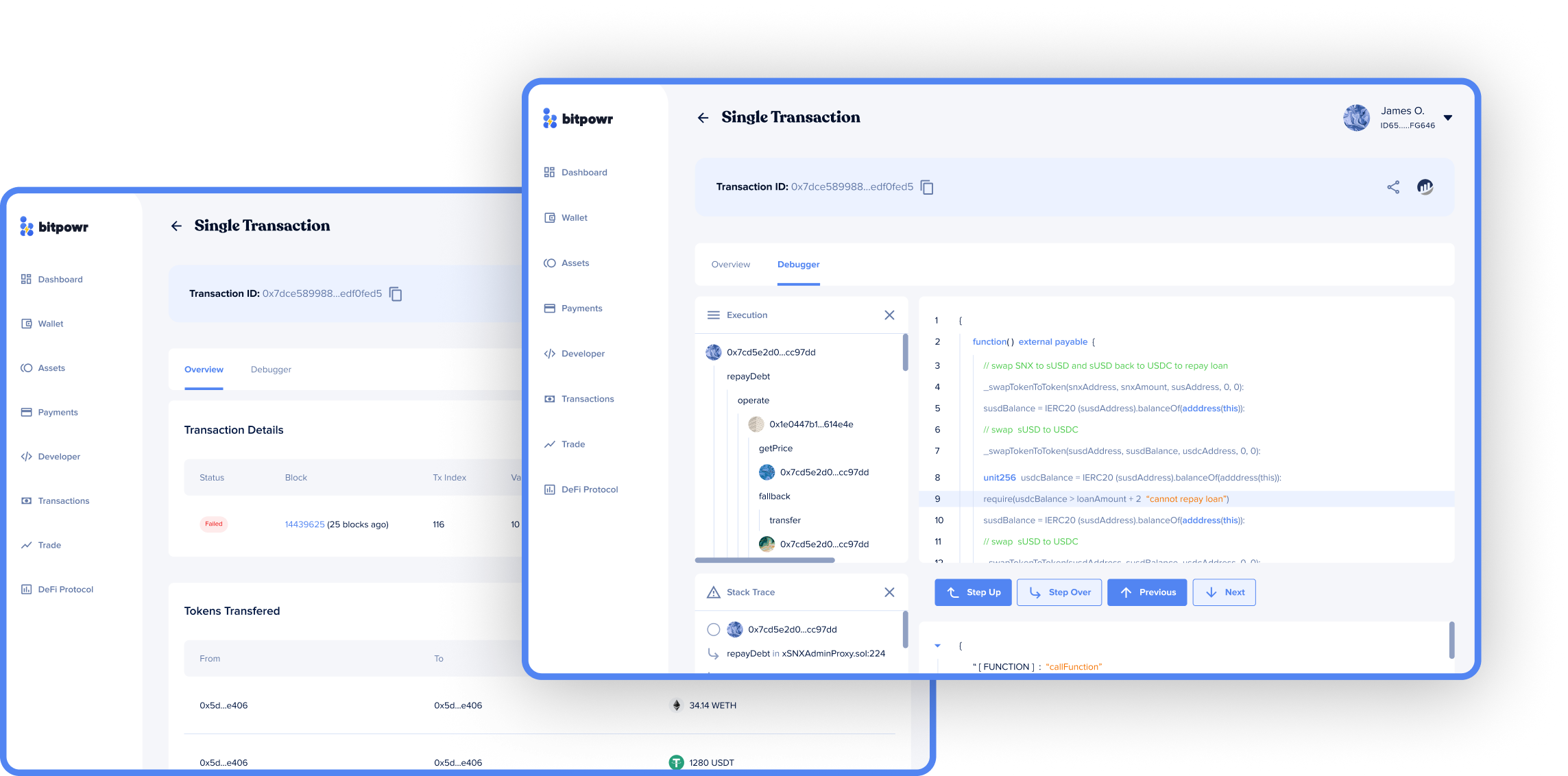
Deep Transaction Monitoring
The Problem: Blockchain transactions often feel like a “black box.” When a transfer is pending, developers and finance teams had no way to see the technical status or identify why it might be stuck.
The Strategic Shift: I built a Technical Debugger & Monitoring View for every transaction, showing the exact block height, gas fee details, and internal approval stages.
My Thinking: Providing this level of transparency reduces “transaction anxiety.” By giving teams the tools to self-diagnose issues, we significantly lowered the volume of support tickets and improved overall platform trust.
Mobile Responsiveness: Portability Without Compromise
The primary goal was to ensure that Bitpowr remained a fully functional business tool across all devices. Since financial officers often need to monitor global liquidity or authorize time-sensitive multi-sig transactions while away from their desks, I focused on a Mobile-First Adaptive Strategy. Rather than just “shrinking” the desktop view, I re-engineered the complex tables and transaction monitors into touch-friendly components.
Key Metrics Observed
Measuring impact isn’t just about “pretty screens”, it’s about whether a treasurer can finish a multi-sig setup without calling support.
Before Redesign
Median team setup to first transaction sat well past half an hour.
Most enterprise teams needed a support call before completing multi-sig.
Demo-to-paid conversion stalled because the dashboard read like a developer tool.
Churn was concentrated in the first two weeks, before the product proved its value.
After Redesign
Median team setup to first transaction dropped to single-digit minutes.
Multi-sig completion shifted to self-serve, lifting the share of teams onboarding without support involvement.
Demo-to-paid conversion improved as the dashboard started reading like a finance product, not a wallet.
First-month retention held across the early enterprise cohort, two of which brought eight-figure custody under management.
Key Takeaways
Governance as UX: I learned that in B2B FinTech, “Security” and “User Experience” are the same thing. A feature that feels safe is a feature that will be used; design is the bridge that builds that institutional trust.
Scaling for Complexity: Designing for 100+ assets taught me the importance of Information Architecture over visual flair. Tables and data density are superior to “cards” when a business operates at scale.
Removing Technical Bias: My role was to act as a “translator” between complex blockchain protocols and the financial stakeholders who need to execute business goals without needing a degree in cryptography.
Enterprise teams ran custody operations without calling support on day one.
Single-digit min
Median time from team setup to first transaction. The pre-redesign baseline sat well past half an hour.
Self-serve
Multi-sig setup completed without a support call by the majority of new enterprise teams.
Eight-figure
Custody under management across the first enterprise cohort inside the launch quarter.
The audience was treasurers and ops leads, not crypto natives. Designing this like a finance product instead of a wallet was the unlock. The numbers tracked it.